Why the Tropicana Rebrand Failed
BLOG
In January 2009, PepsiCo launched redesigned packaging for Tropicana Pure Premium. By February, sales had dropped 20% and the reversal had been announced. The full cost, covering design fees, the advertising campaign, and lost revenue, came to an estimated $50 million.
The Tropicana rebrand is cited regularly in brand management contexts. The standard reading is that consumers resist change, that nostalgia is powerful, that people are creatures of habit. That reading captures something real. What it misses is the specific mechanism that made the failure so fast and so costly.
Why the brief treated recognition as a problem
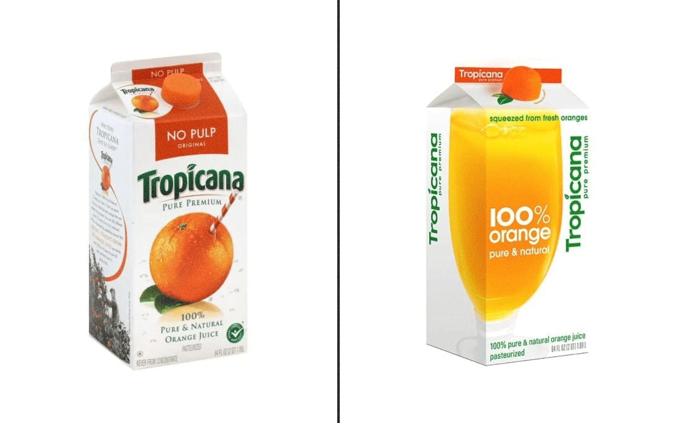
PepsiCo brought in designer Peter Arnell to refresh the Tropicana packaging in 2008. The brief was clear about what it wanted to move away from: the orange-with-straw illustration had been on the carton since 1954, and the view internally was that it had become dated, too literal for a contemporary audience. The goal was something cleaner and more modern.
The orange-with-straw had been doing its job so consistently, for so long, that its function had become invisible to the people writing the brief. What they described as aesthetic staleness was the legible surface of fifty-five years of accumulated visual equity. Shoppers were not stopping to read the label. They were reaching for the orange from across the aisle, navigating the chiller section by image, often without breaking stride.
The redesign removed that image. A close-up photograph of the fruit replaced it, and the logotype was repositioned vertically on the carton. By most design standards, the result was competent: restrained, contemporary, well executed. It was simply not the thing people had been reaching for.
Brand shorthand and category shorthand
A visual identity typically carries two kinds of information simultaneously. The first is brand identification: this is Tropicana, not Simply Orange or Florida's Natural. The second is category identification: this is orange juice, in the right aisle, oriented correctly on the shelf.
Most brands handle these functions with separate elements, colour, mark, and logotype each doing distinct work. The Tropicana orange-with-straw had collapsed both functions into a single image. It identified the brand and announced the category in one visual gesture. When the image was removed, shoppers lost both signals at once, with nothing in the replacement design carrying the weight of either.
Tropicana reportedly received tens of thousands of letters, emails, and calls in the weeks following the launch. Many described the same experience: they had stood in front of the Tropicana section and could not find the carton they had been buying for years. The new packaging was disorienting rather than disliked. The company reversed the decision on 23 February 2009, less than six weeks after the new packaging reached stores.
Why the reversal happened so quickly
A brand with genuinely weak visual equity tends to lose sales gradually. The signal is diffuse, and it takes months to read clearly. Tropicana's sales dropped fast enough for the reversal to come within a single news cycle. The speed reflects how much structural work the old identity had been doing.
The $30 million in lost sales within six weeks was documented precisely enough to make the decision straightforward. The full accounting, including design and advertising, came to over $50 million. It remains one of the most precisely costed examples of the expense of retiring accumulated visual equity without a replacement plan.
What the 2024 update got right, and where it still ran into trouble
Fifteen years later, Tropicana redesigned again. In European markets, the orange was restored to a central position in the identity, the typography was updated, and the visual language was made more contemporary without discarding what the original mark had built. That version of the project drew directly on the 2009 lesson: the visual equity needed to travel forward.
The US update took a different route. The bottle changed from the familiar 52oz carafe to a narrower 46oz container. Consumers read the smaller size as shrinkflation regardless of the retail price guidance, and sales fell again through the second half of 2024. Keeping the visual equity intact was the right call. But visual identity is one layer of the relationship between a brand and its customers, and separate decisions affect that relationship independently.
Why modernisation briefs miss the structural work
The longer a visual identity has been doing its job, the more invisible that job becomes. A mark that has been working quietly for decades does not announce what it is carrying. The brief to modernise an image tends to see the aesthetic surface and overlook the function underneath.
A modernisation exercise is almost always legitimate. Packaging ages, design conventions shift, and categories evolve. The challenge is understanding what the existing identity is carrying before the new brief is written, so the replacement can be built to carry the same weight. That diagnostic step is easy to skip when the equity is invisible, and it becomes measurable only after the change has been made.
South works with clients at this point in the process: before a visual identity is changed, when there is still time to understand what the existing one is doing and brief a new one that carries it forward.
If you are planning a brand refresh or website redesign, get in touch with the South Design team.